My data visualization coded in JavaScript and D3.
Background
Learning the foundations of JavaScript was one of the most challenging and rewarding things I've done. This visualization was inspired by COVID molecules and created using JavaScript and D3.js. This was my first time learning a programming language, and the visualization above was my final project for my Programming Foundations class. You can access my code on GitHub.
Project Details
My goal for this project was to gain an understanding of President Trump's approval rating. I was looking to explore possible correlations between his approval rating and his Twitter activity (tweets and retweets). Twitter seemed to be his main source of communication with the general public, so I wanted to see how it affected his approval rating. In case no correlation was found, I also recorded other economic factors:
• weekly average U.S. gas prices
• daily stock market closing prices for S&P500 (SNP), Dow Jones (DJI), and Nasdaq (IXIC)
• weekly unemployment figures
• daily new and confirmed COVID-19 cases in the U.S.
In order to try to measure the full impact of how COVID-19 might have affected Trump's approval rating, I compiled a year’s worth of data starting from Jan 1st-Dec 31st, 2020.
Hypothesis
Due to Trump's unconventional presidency, I predicted that his Twitter activity would have the greatest correlation with his approval rating compared to other recorded economic factors or new and confirmed COVID cases at a national level.
Process
Although this project only required a minimum of two months of data, I soon realized how difficult it would be to identify any meaningful information within such a small time period. Most of my data points had incremental daily change. It also occurred to me that in order to measure the full impact of how COVID-19 may have affected Trump's approval rating, along with other factors, it would be important for me to compile a years worth of data.
Because of this, I decided to collect data beginning from January 1st through the end of the term to see the full effects of COVID.*
Everything was recorded in a spreadsheet and converted to JSON format as needed throughout my coding process.
Data Analysis + Discovery
Once I compiled most of a years’ worth of data, I used bubble plots to analyze my recorded properties. I spent a large chunk of time measuring each of my factors against Trump’s approval rating. The use of bubble plots allowed me to focus on my data rather than getting lost in the design of my visualization.
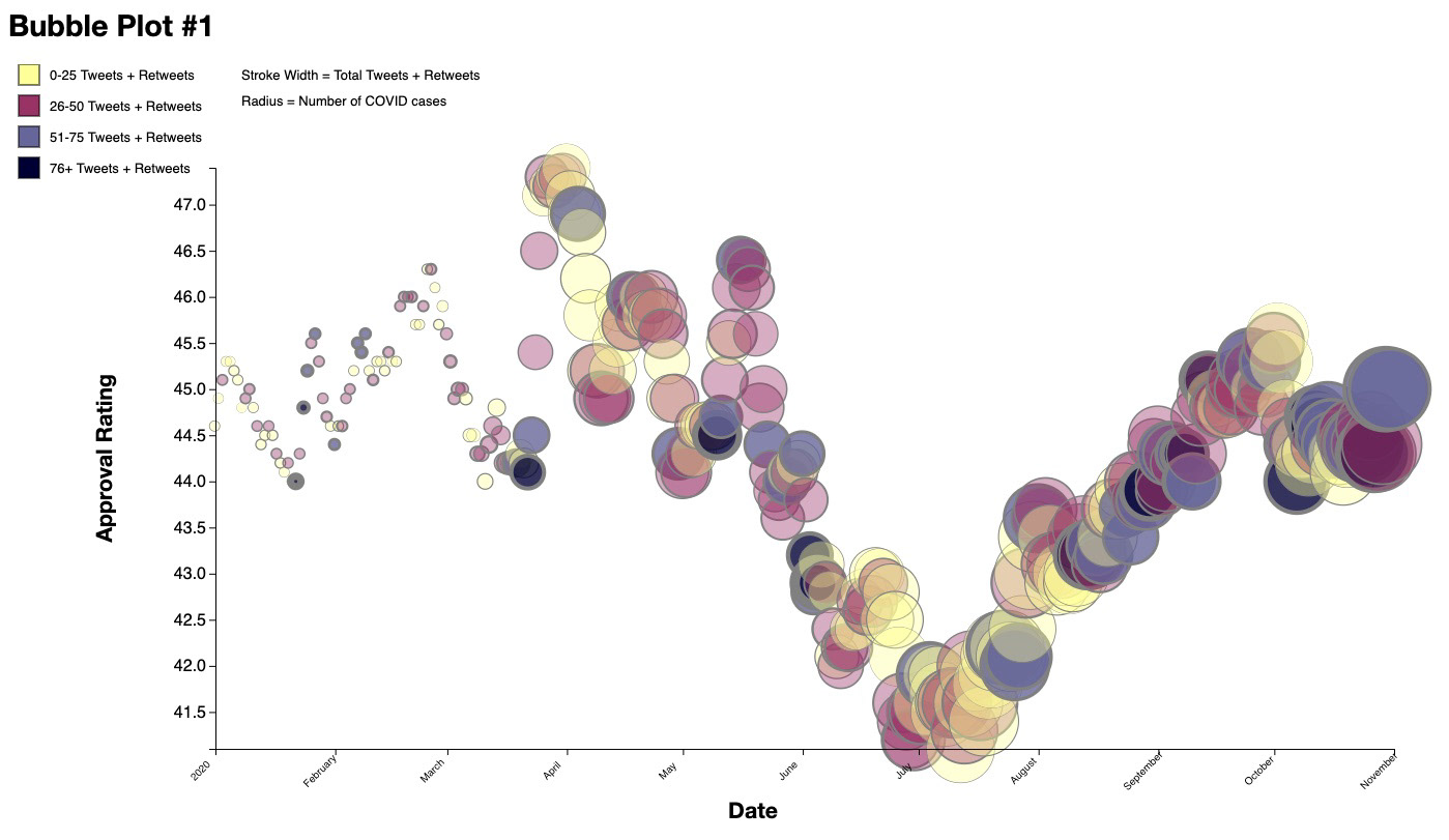
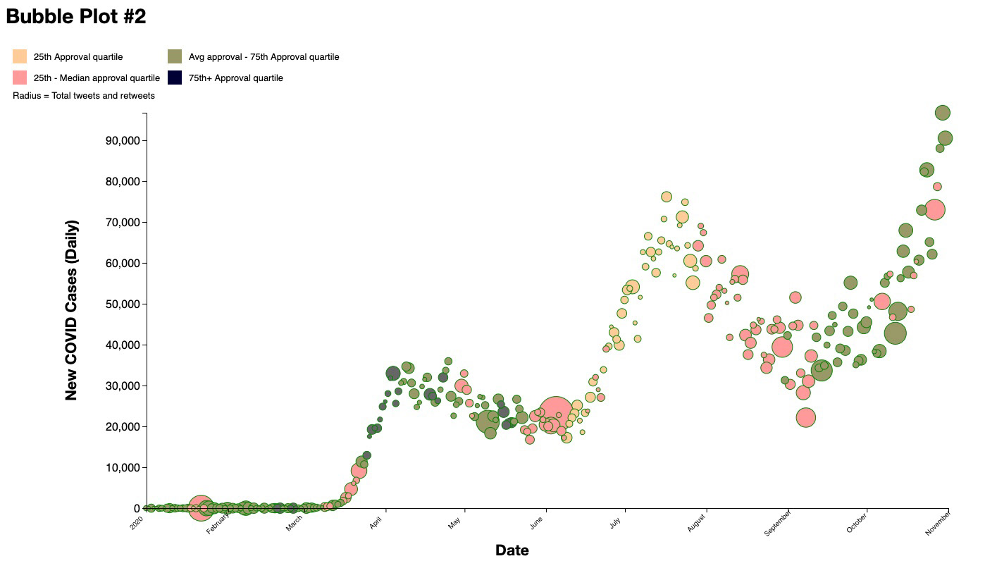
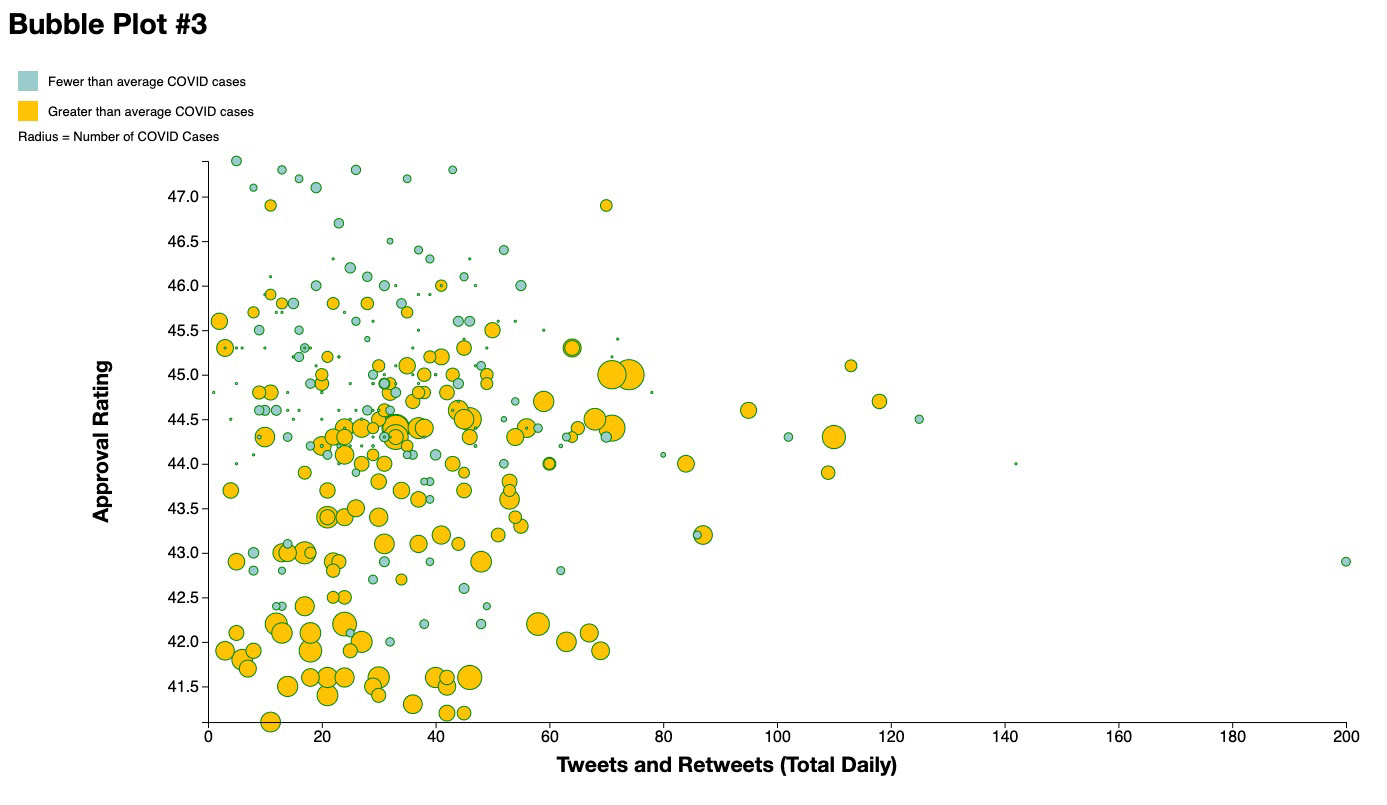
In early November when I had made these bubble plots, I discovered that total daily COVID cases was the only property to show some sort of correlation with Trump’s approval rating and Twitter activity. These findings helped me move forward in my process and decide to focus my final visualization on three properties:
• Trump's approval rating
• Trump's Twitter activity
• Nationwide total daily COVID-19 cases
With much to code and little time to spare, I set forth on the next step of my project: brainstorming visualization designs.
Ideation
I had spent a significant amount of time fawning over beautifully crafted postcards sent between two information designers, Giorgia Lupi and Stefanie Posavec, of Dear Data. Lupi and Posavec managed to take seemingly mundane data from their everyday lives and transform it into striking, hand drawn visualizations.
Pulling inspiration from their postcards and wanting to create a visualization relevant to my project, I drew up several sketches. My challenge was coming up with a design I'd be able to execute with my newly learned coding knowledge. Eager for a challenge, my two sketches below were what lead me to my final visualization. I digitized them in order to present them to my class.
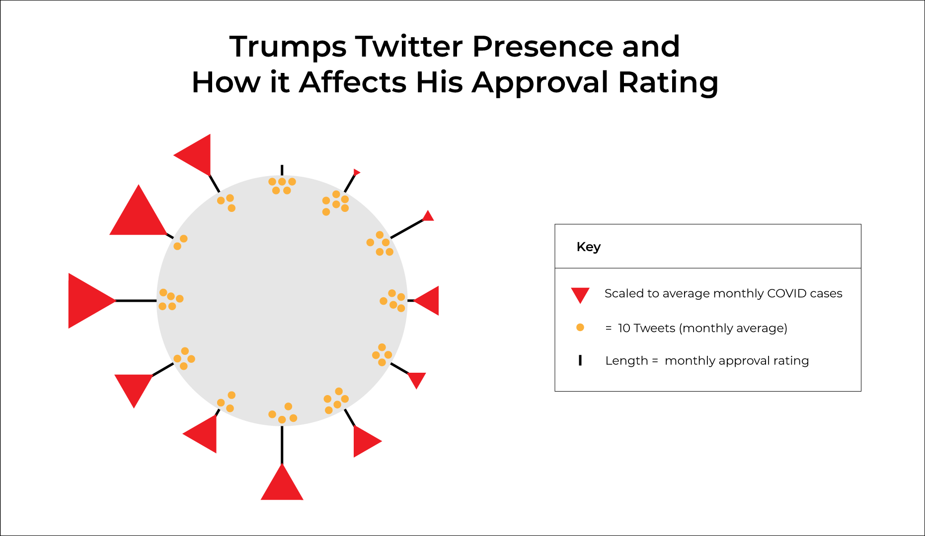
All data is converted from daily values to monthly averages. Each COVID "spike" represents a month of data.
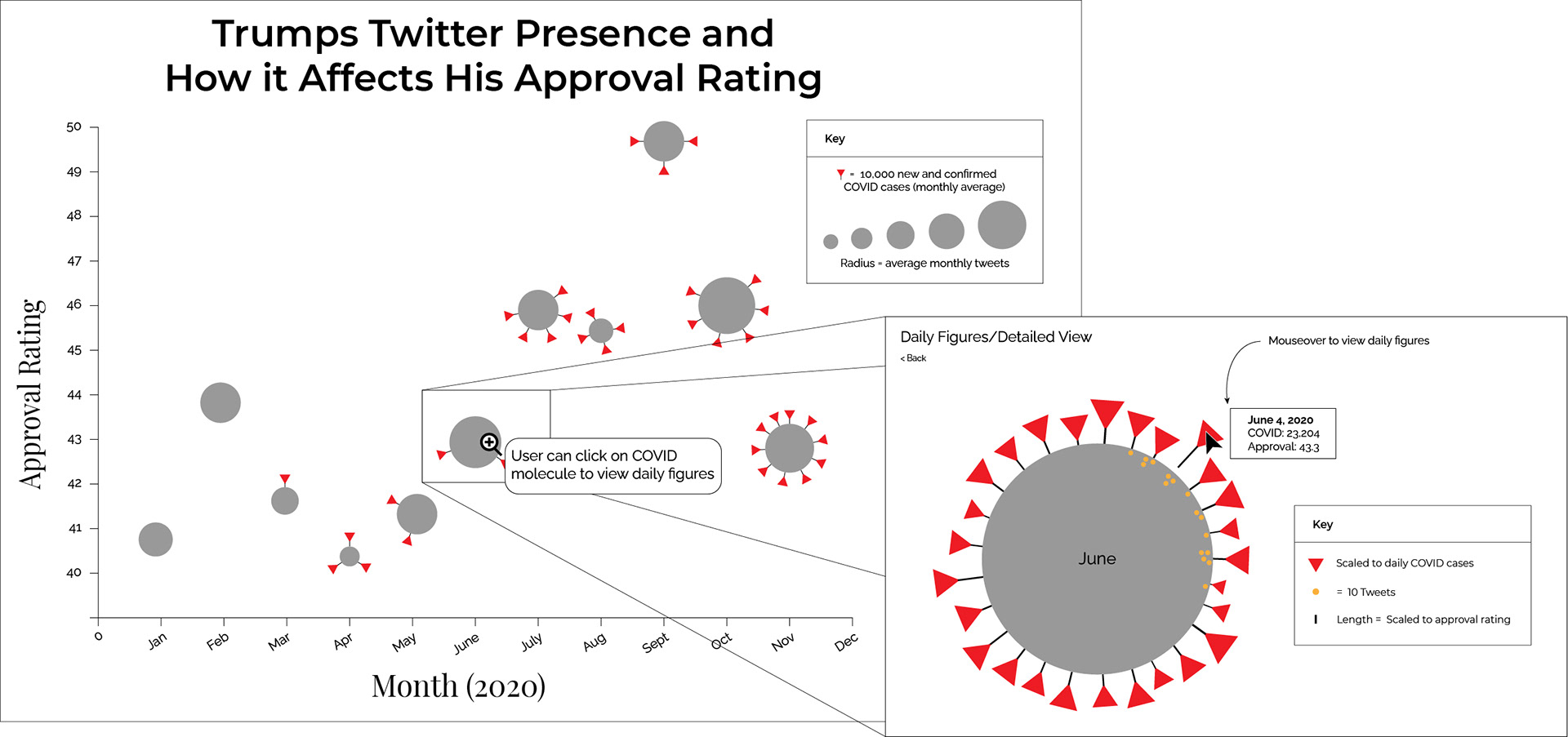
Data is grouped into monthly data and COVID molecules represent a month of information. Option to click and view more details/daily figures.
Although both designs had their flaws (overly simplifying my project or requiring code well beyond my coursework), I knew there were elements from each that I wanted to keep.
With a design in mind, I put my JavaScript and D3 knowledge to the test. I wrote code to create data structures which manipulated my JSON data to match the needs of my design. Essentially, this code organized my independent daily data to a grouped monthly data format. It then separated everything by category before calculating monthly averages. This allowed me to customize my visualization and shape my monthly COVID molecules as needed to convey my findings.
Outcome
I originally predicted that Trump’s Twitter activity would affect his approval rating more than my other recorded economic factors and our current COVID-19 pandemic. But as you can see in my annotated final visualization, my hypothesis is unsupported. Although there were times when increased Twitter activity appeared to have a correlation with increased approval rating (July—October) this observation is inconsistent.
Trump’s approval rating rose even with low Twitter activity and significant increases in daily new COVID cases. I decided to emphasize the surprise and confusion I felt from these findings by intentionally keeping the crowded molecules of September—December as is. I wanted this part of the visualization to feel chaotic and relative to the outbreak of COVID-19 cases nationwide.
Reflection
If I were to collect additional data for this project or improve my visualization, I would look for sources that broke down Trump’s approval rating by political affiliation. What I really expected to see was increased approval ratings from Republicans as Trump tweeted more, and the opposite from Democrats. I would also consider recording other data such as historical events in 2020 or diving deeper into Trump’s Twitter statistics.
Overall, I thoroughly enjoyed this project. It was immensely challenging, extremely rewarding, and set me on a path to continue learning about JavaScript, data collection, and data visualization.
Sources
Approval ratings: Real Clear Politics
Tweets: Trump Twitter Archive and The Trump Archive
Gas prices: U.S Energy Information Administration
Stock Market closing prices: Yahoo Finance (IXIC, DJI, SNP)
Unemployment figures: U.S Department of Labor
COVID: The COVID Tracking Project
* Original data for this project was collected from January 1, 2020 through December 7, 2020 (the end of the term). Since then, I have updated the project and collected data for the remainder of the year. JSON data was last updated on February 18, 2021.


