BACKGROUND
Green Our Planet is a non-profit that has become the largest outdoor school garden and hydroponics program in the U.S. Their programming includes hydroponic gardening systems for grades pre-K–12, along with grade-level STEM curricula to go with it. With the goal of expanding their hydroponic programming across the country, Green Our Planet sought help in redesigning their website.
I worked on this project as a solo designer and researcher for my Capstone course. To ensure the redesigned website would be of value to Green Our Planet and their users, I spent the bulk of my time in the discovery and research phase before jumping into design.
DISCOVERY
I interviewed stakeholders to learn about the organization, their goals, and their offerings, analyzed their existing website, conducted market research to gain familiarity of the education landscape, and conducted user interviews to learn about Green Our Planet’s primary users—educators.
Problem
What I learned from my discussions with stakeholders is that Green Our Planet is having a hard time getting schools to sign up for their programming despite being able to offer them a grant that would cover 80% of their costs.
What this communicated to me is that a vast majority of teachers and school administrators are not seeing the value of Green Our Planet. They struggle to understand the offerings as listed on Green Our Planet’s website, and the result is the inability of teachers to determine if Green Our Planet’s programming meets their needs.
Research Objectives
In order to design a meaningful website for Green Our Planet, I interviewed six different educators working in public and private school sectors across the country. My goals were to:
• Understand their role, authority, and day-to-day at their school
• Learn about their involvement and process in curriculum design
• Identify their pain points and goals
Research Findings
What I discovered is:
• Every teacher I spoke with worked “overtime”
• Teachers are pressed for time during the school day, oftentimes working with minimal breaks
• Public school educators found the reduced hydroponic programming costs to be extremely affordable and asked for more details to apply for their own hydroponic garden
• When investing in 3rd party curricula, similar to those offered by Green Our Planet, educators want to be confident that the curricula has been vetted for by other teachers and that it’s challenging and grade-level appropriate
In summary, the new website will need to provide clear messaging to educators and be easy to navigate so that they can quickly find the information they’re looking for.
I used an affinity map to organize my research and look for commonalities between my interviewees.
DESIGN AND STRATEGY
While my initial task was to redesign Green Our Planet’s website, I knew it wasn’t the solution to their problem.
After analyzing their site and speaking with stakeholders, it became clear to me that the organization had grown quickly, and that the website struggled to keep up with this growth. This resulted in an expansive site that had a lot of design debt the organization could not effectively maintain.
Realizing this, I made it my main objective was to educate the Green Our Planet team on the importance of user centered design and shift their underlying strategy to reflect this. My redesigned website would simply be a vehicle to help facilitate this change.
Early design explorations
Being a standalone designer and researcher, I limited the scope of my deliverables to include 5 different page redesigns. Each page had a clear topic but was made with various templates that Green Our Planet would be able to remix and reuse for different parts of their site.
I started by weeding out the most important pieces of information from their existing site that educators would find useful, and then created two new concepts to fill in gaps in information that educators may see missing from their website today. These two concepts were:
• “Beyond the Classroom” – Additional benefits that Green Our Planet’s hydroponic gardens provide in addition to STEM education
• Custom school templates – A personalized webpage tailored to a school to address their specific needs and concerns
I sketched wireframes to test out my ideas and then jumped into Figma. After a few iterations and feedback sessions, I felt confident my designs would inform educators about Green Our Planet’s offerings and help them decide if these programs met their classrooms needs.
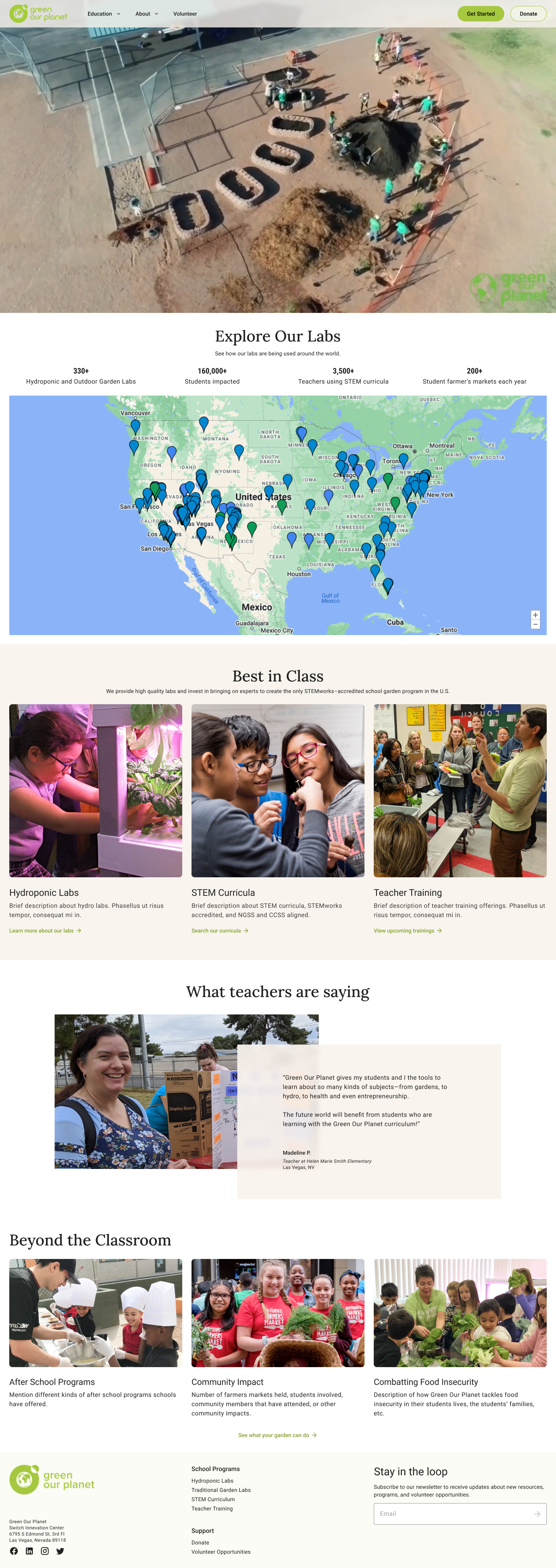
Home Page
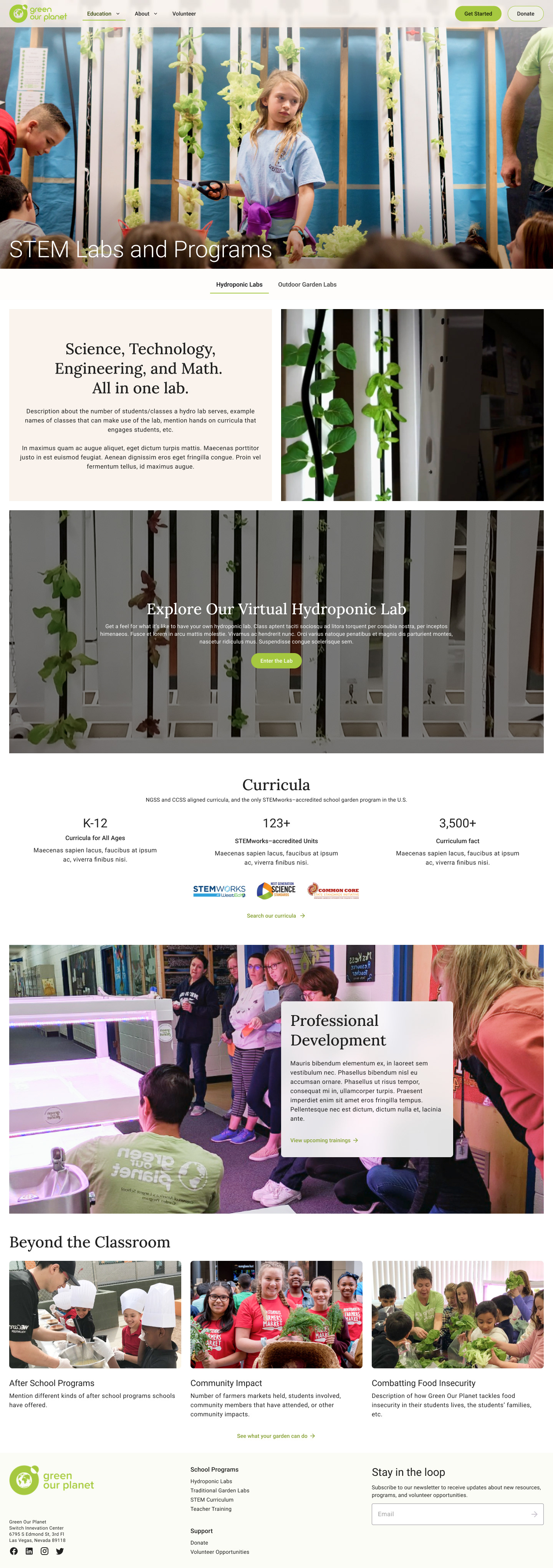
STEM Labs and Programs
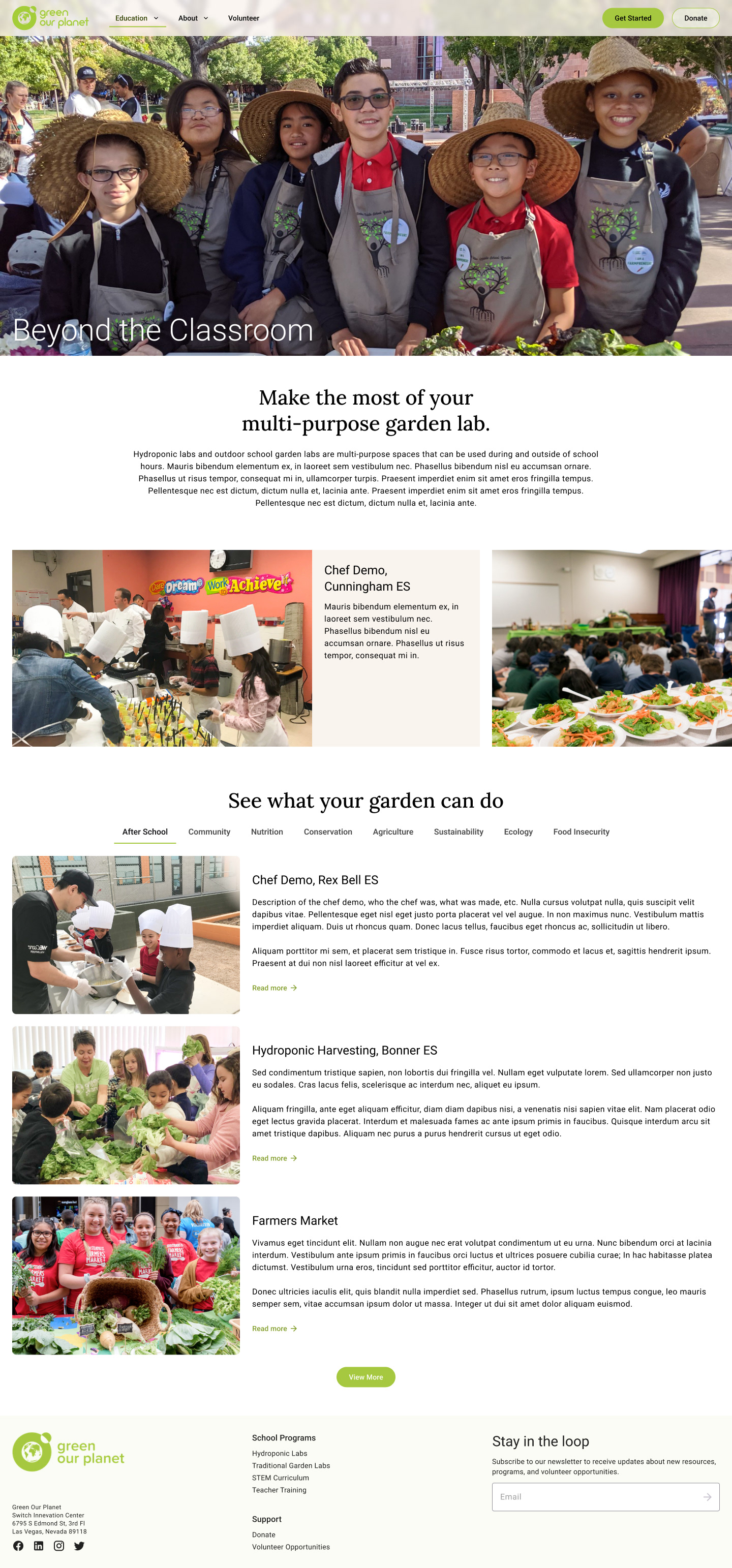
Beyond the Classroom

Custom school template

Who We Are
RESULTS
I presented my process and designs to the Green Our Planet team and made sure to emphasize the importance of shifting to a user-centered mindset. I focused my presentation around the research findings that influenced my design decisions and was sure to address how each part of the redesigned site addressed educators’ needs.
By the end of my presentation, the Green Our Planet team realized they had created a website for themselves, not their users. Recognizing their error and now having a clearer direction in mind, I received an update from the team three weeks later stating that many of my recommendations were in the process of being implemented.
