Background
Rock Spot South Boston is one of two rock climbing facilities located in the heart of Boston, MA. I approached them to redesign their website as a project for my Interactive Design class. To ensure my design would be of value to Rock Spot, as well as to real users, I conducted user research and interviewed their Director of Marketing, Pete S.
My deliverables include user research findings, overhauled information architecture (IA), updated content, a brand style guide, new navigation and footer, wireframes, and eight different page designs along with their responsive mobile counterparts.
Discovery
To start, I needed to gain an understanding of Rock Spot's business goals, brand, and users. I met with Pete and identified key takeaways:
Company and Brand
• Their values include accessibility and inclusivity with regard to pricing, gender identity, sexual orientation, age, and more
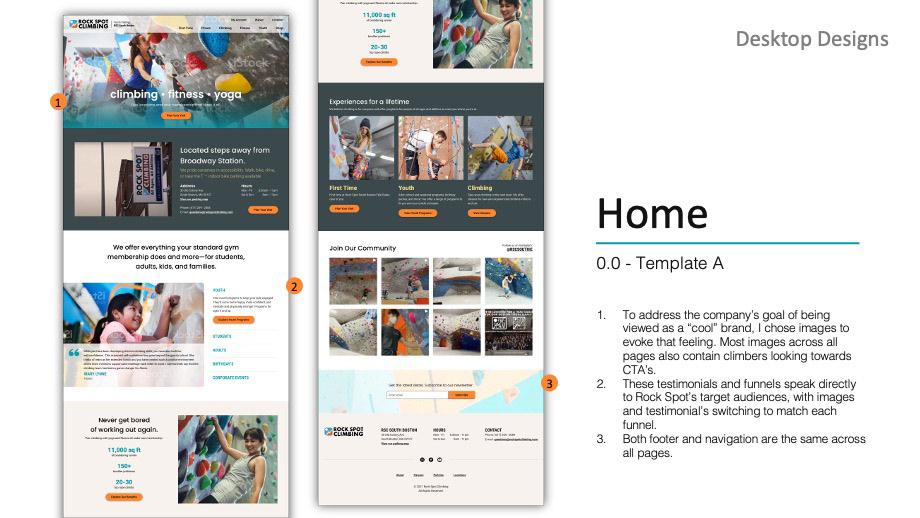
• The goal for their future brand is to be viewed as a “cool” brand to college students and more serious climbers while remaining inclusive to new climbers and families
Target Audience
• College students (50%)
• Young professionals, 21–29-year-olds, without kids who live in the city (25%)
• Families who live in the city/close to the gym (25%)
Identifying target audiences helps keep users at the forefront of the design process. I needed to be able to visualize these user groups and have an idea of who to recruit for research.
Process
I performed a content audit of their existing site and created a detailed document listing everything from navigation items and climbing classes, to broken links, and certain interactive elements.
Once complete, I reviewed and edited content as needed. I changed “Send Squad” to “Adult Team,” “A mindful approach to training for climbing” to “Climbing Clinic I,” and so on. With a lot of information to work with, I analyzed local competitors’ websites and climbing gym websites across the country to identify different organizational structures and less important items to remove.
User Research
While this course didn’t require me to conduct user research, I believe it’s crucial to involve users in the design process. For this project, I conducted card sorts and usability tests to guide me in classifying and structuring content.
Card Sort
I recruited six participants (climbers and non-climbers) and had them sort 41 electronic cards over Zoom. I discovered three key findings:
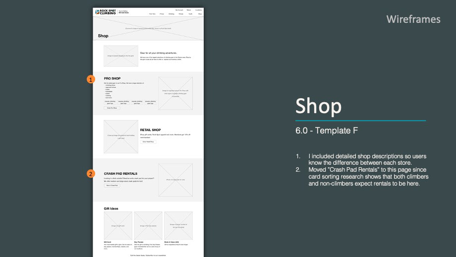
• 4/6 users grouped “Crash Pad Rental” with “Pro Shop”, “Retail Store”, and “Gift Cards”
• 6/6 users didn’t know what “Homeschool” entailed
• Non-climbers weren’t sure what “Top Rope” meant
Usability Test
I conducted two moderated usability tests to discover what users’ perceive as the most important information when choosing a rock climbing gym. I found that users primarily consider three things when choosing a gym to climb at:
• Price
• Photos (to get a sense of climbing wall terrain)
• Location/proximity.
I also had users navigate Rock Spot’s current website and discovered that they:
• Felt overwhelmed by large photo carousels
• Got frustrated and lost navigating menu items because they kept getting redirected out of the South Boston page to the main Rock Spot page
• Didn’t find current website photos to be informative of gym features
• Were impressed by Rock Spot South Boston’s climbing terrain once they watched a video of someone climbing on their Instagram plugin
Sitemap
With a better understanding of users’ mental model discovered through card sorting and usability testing, I updated my content audit and created out a sitemap.
Sitemap created using diagrams.net.
Wireframes
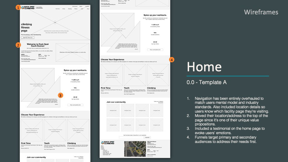
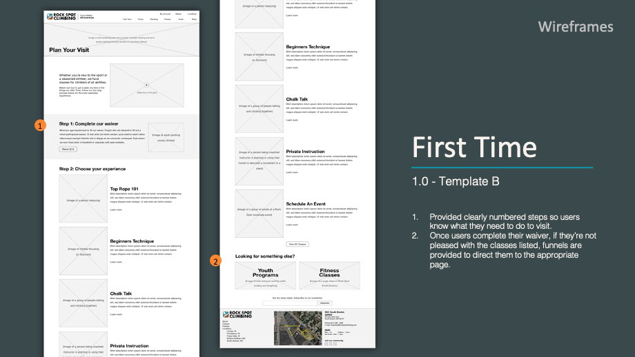
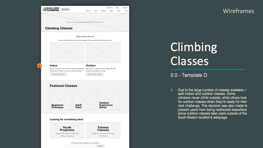
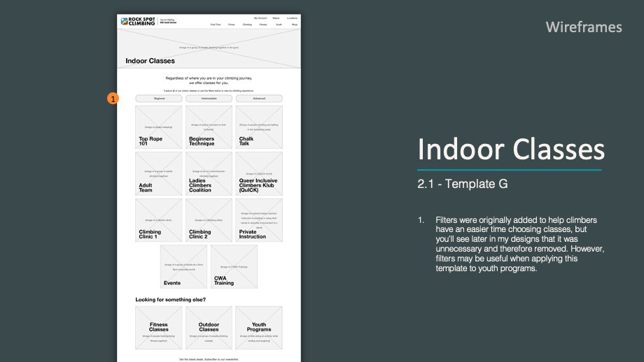
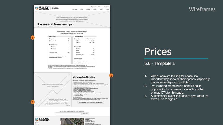
Once the information architecture (IA) was laid out, it was finally time for me to sketch wireframes. I drafted several iterations, updating each version based on feedback. My primary focus during the wireframing stage was to improve usability and content.


Style Guide
Seeing that Rock Spot South Boston’s current webpage needed more visual hierarchy and consistency, I created a new style guide.
For fonts, I chose sans serifs (Poppins and Roboto) for legibility. Both fonts offer a variety of weights to emphasize content and to help with establishing hierarchy.
For my color palette, I selected a combination of warm and cool colors to match their logo while also evoking an outdoor/nature feel that's in line with the climbing and outdoor industry.
Design
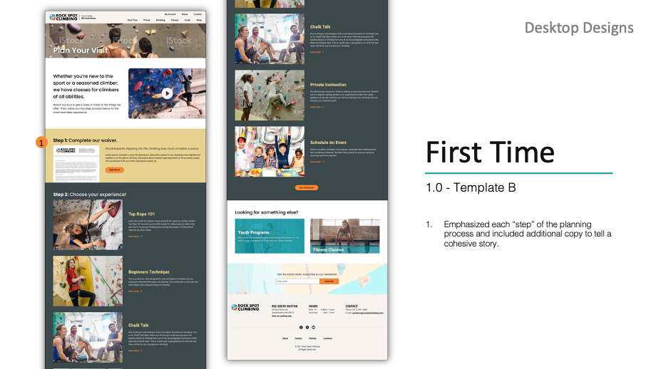
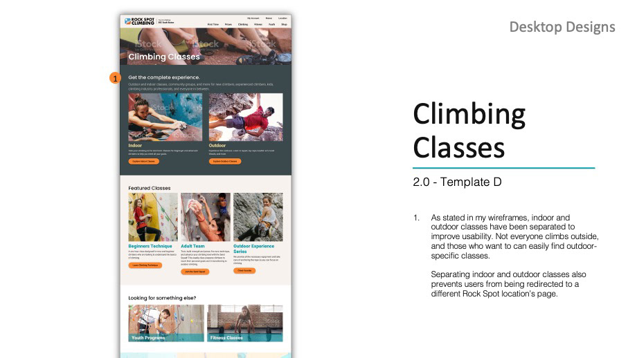
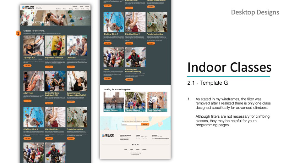
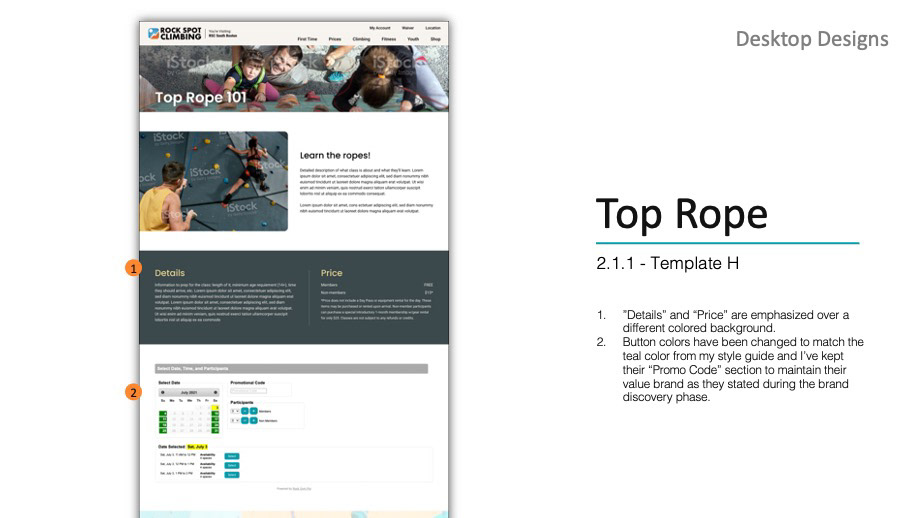
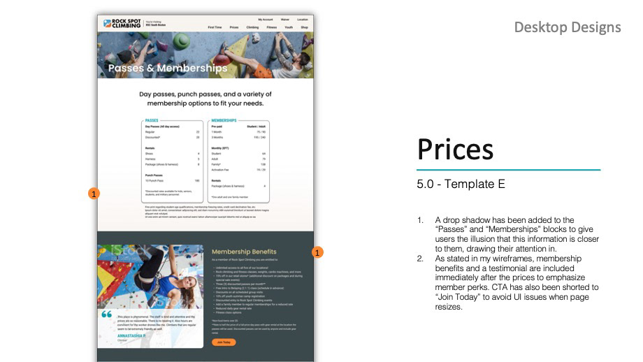
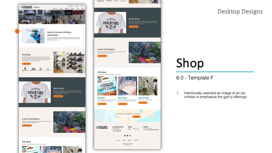
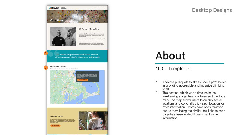
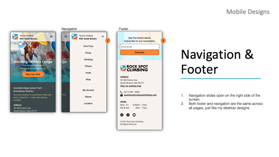
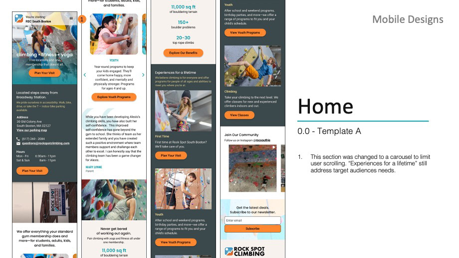
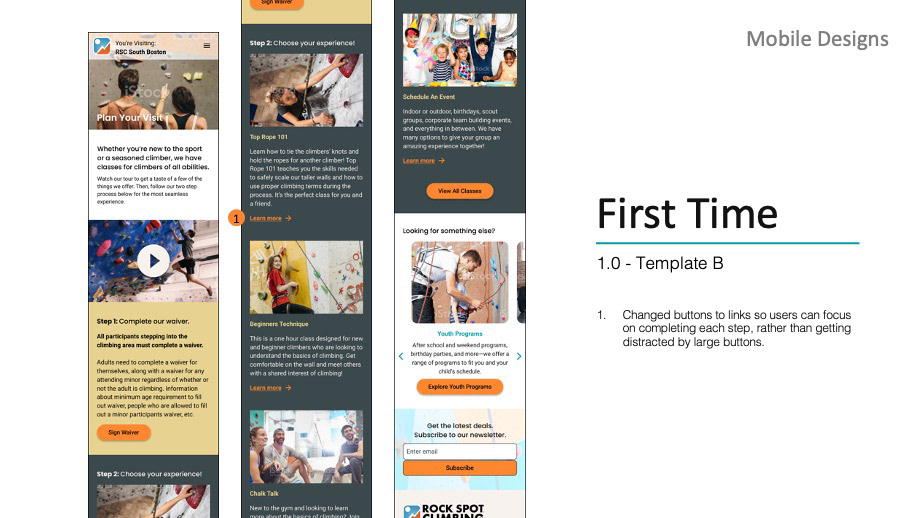
I merged all of my research, sitemap, wireframes, and style guide to design Rock Spot South Boston’s new webpage. All eight of my desktop designs are shown below, along with select mobile designs.
You can also view both my desktop and mobile designs on Figma.
Desktop
Mobile

Reflection
User research proved to be very helpful when presenting to stakeholders and when making design decisions. It’s vital to prioritize usability over aesthetics. As you can see in my process, visuals came last.
While there’s still a lot of work to be done, such as finding better ways to name and organize youth programs, and conducting more usability tests, my redesign provides a solid foundation for Rock Spot to work with. If I had more time I would have conducted more usability tests throughout the process, and again after completing the design. Should Rock Spot decide to continue developing on my work, I would recommend conducting additional user research to ensure usability among all target audiences.

